Showing posts with label studio. Show all posts

Wednesday, October 15, 2014

Pixel tutorial

My ability to draw has always been hit or miss, I had fundamental classes in high school and would occasionally doodle, but always avoided the human figure because of its difficulty. And I still find it so, probably always will. But through doodling and what I retained from the classes I've taken so far in drawing I've picked up a few hints that helped.

1. Practice/mentality, it's a duh moment but it's true. Most important though is to practice the right way. When you're just drawing things off the top of your head and you're having trouble making them look photorealistic or "life like", then I suggest trying to draw something out of a photo. This isn't tracing, this is exercising the eyes' ability to notice and the hands' ability to translate that. Drawing is 99% in the head, and 1% in the hands and eyes. If you can see it, you can draw it as you see it. Where you start doesn't dictate where you end up. The trick is to exercise that link between the hands and eye. Seriously, anyone can do it. To quote Garfield from the animated series Garfield and Friends, "it's just lines on paper." And that is unarguably all it is, just like how paintings are just paint on canvas. And it's not in any explicit way of how that paint is put on, there isn't any technique or way to move that dictates how well the lines end up looking. It's in seeing what the lines do, and recognizing what that means in relation to the piece as being presented as you work, and keeping that in mind as you work. What this means is as simple as "that line on his ear comes in too far, makes his ear look too big".  And then making the line come in a little. That is literally all drawing is. A bunch of that one, line and alteration after the other until you feel happy with it. Reason experienced artists make it look so easy is they've exercised that hand/eye/brain coordination so much they can more quickly approximate what they see in their head on paper, where with the rest of us faces start off looking vaguely potato-ish, they know how to draw the right face shape from practice. Just like those pieces you see the tourists artists do in no time at all that come out looking good, they've practiced how to make what they see so often their hands just know what to do.

Now, I like pixel art for two reasons. First because regardless of how many mistakes I make the canvas doesn't show so I always feel in control of the finished product, and secondly because there is a total abandon within having definite color and space. I can pick this or that pixel to color, but no where in-between. I have a limited pallet and can only attempt to replicate a degree of what colors exist in real life. While, say, this image


has a massive number of shades of grey and very specific locations for the white flakes in his hair, I cannot hope to perfectly replicate that, but in pixel art I can approximate it. It will never be perfect, Wittgenstain is made of smooth edges and not squares, as is the tradition of pixel art I'm only using two colors to highlight the pixelness of it.  
  
2. The flatland. (I actually meant to have more photos showing my progress before this step --will do next time-- but I got distracted. )


This second aspect to art I want to use these early saves to illustrate. Make things flat. People often think they aren't arty enough to get the angles on a room just right and make 'depth' or just can't get the proportions right to make something look... not deformed. But the fact that your eye is able to pick up that you're work isn't 'right' just yet means you have the capability to notice what is off, with is all it takes with diligence and slight alterations to make something looks right. The easiest way to approach this is to flatten things. Drawing still life or things laying around the house is really hard because as you look back and forth you wind up moving your head slightly and because of your perspective the angles on the piece change. You end up constantly altering the proportions of the piece. With practice you can learn to avoid this. But for beginners or those trying to get a bottom up refresher of their abilities(which every artist should do occasionally, imho), start drawing things from photographs. Next is to break the image down into less complex shapes and distances. 'The eye is ovalish, half way down the head, a little squared over here..' ect. This is the same for the negative space. Instead of seeing where to put that tiny ear in relation to all this white, imagine figuring how to fit this large triangle thing between the shoulder and the ear. 'Okay it comes up to a little higher then half the image, bends right below the ear here and slightly closer towards the neck down here.' Start by building your basic outline and move in. Remember to strictly avoid detail work at this point, you're getting the layout of the image. Start sharpening the edges of that layout.


3. Details. Treat every detailed spot like you approached the general layout, start with the big stuff. 'this spot is all black' 'this corner is more rounded' 'this has little hairs sticking up' and then move onto more intricate stuff.
 (As a side note somewhere in the above I said there is no direct technique that leads to how a piece turns out. I kinda lied, the grey stuff is dithering, it's a technique of spacing squares in a checkered or 'cross' pattern to replicate shading. It's a way to keep the pallet color down while simulating shading, similar to crosshatching as seen in comics/print. )

The rest is the back and forth, glance at the reference picture, make a decision how to shade/represent what is there, look at the image see what could be wrong. When you are at this point getting a pair of outside eyes can be very beneficial, also looking at your piece from different angles i.e. turning the image and canvas upside down. Replicating something upside down is a common experiment in early drawing classes and I recommend it, by having a face upside down the brain doesn't so easily recognize it as a face and allows you to more easily see it for it's angles and edges. About here a talented artist friend of mine mentioned how not only was the chin far too thin, but the neckline doesn't go in so drastically, that the whole left shoulder (in relation to viewer) was in too far. Within the next three panels I work on correcting that along with other slight alterations with the eyes and brow. Then carry on to darken the dithering on the other side of the face, make slight alterations to the hair, and work more on the eyes. Click on the first image to be able to cycle through the images without seeing the text to see the changes better side by side.


A great way to break down the shading in a piece, especially a monochromatic, is to squint at it. Or in my case take off your glasses. The details get lost but suddenly the overall shape and shading becomes more clear (in a manner of speaking). A pixel art piece of an image is in a way already a blurred/distorted version of your image, so when you squint and compare the too your eye will better see the features that translate and more importantly where they don't. Try it out: comparing the bottom two, the original image and my piece you'll notice the bottom Wittgenstein's nose is much darker, that there's less shading on his left ear, and that his chin doesn't extend quite so long. With open eyes of course his left eye needs work, it's not clear where his eyeball and eyelid start and stop as it is with the right eye.


You'll notice the comparison is far from 1-1 but it is an approximation. There are light spots I couldn't figure out how to represent near the right side of his temple that I excluded altogether. The dithering more lends itself to suggesting the details and shapes of the face then replicate them. Now the point of this exercise specifically, to attempt to approximate another image (instead of simply creating an image from imagination) is that this teaches the eye how to see in terms of simple things like lines instead of difficult things like faces, and it teaches the mind how to use your medium in approximating certain effects. When your mind and eyes think in terms of the medium you use and you will be better able to clearly imagine a creature in a way to translate it to the paper... or screen.
Until next time, thanks for your time, good luck on your art and goodnight everyone. 


Friday, February 21, 2014

YOU CAN GET THIS PROGRAM FREE UNTIL THE SECOND OF MARCH 2014!

http://www.yoyogames.com/studio/download

Typically a 35 dollar value GameMaker Studio is free to download.. Like right now. I'm no pro at GameMaker, but I've downloaded it an it's on the list of program walkthroughs I'm going to do. Get Studio now if this one catches your eye, if you're ever interested in investing in something it's always better to do it when it's cheap, and if it's free you should just do it incase, seriously. For those of you who roll there eyes at these programs and just want to get into the ground up programming world of game making, I do getting into Java and JDK eventually. Soon as I'm proficient enough with coding, but for full disclosure that really means as soon as I'm not juggling upper level courses with work.

Update on the game stuff. I'd love to say the first engine is complete, but it's not. It's simple a matter of understanding the rolls of in script functions and how they function (which is kinda funny in itself). Quality tutorials for Construct 2 are a little more difficult to find, I'll be putting up the resources I've used and a in depth of the game development soon. 

Saturday, January 11, 2014

Pixelstudio Review and Pixel art/animation(a little bit).

Under no circumstances would I want someone to be in a position where they'd need to use Pixelstudio. As far as I could find there are no tutorials on youtube.. probably because everyone would rather use photoshop or whatever else, but still. Don't use it. I don't know if I'm just using it wrong.. but there's no reason it should be that counter intuitive. But as far as I can tell unless you upload an image with color, there isn't a way to change the color scheme past black and white, or any easy way at least. If you cut an image and attempt to move it elsewhere, the dotted line that typically surrounds it will not go away, not easily. And whenever you try to draw while the dotted line is still surrounding your image your drawing will not place. It won't stay. You can't draw. The checkered "see through" background that you typically want to utilize for the edges of your sprites once uncovered, cannot (seemingly) be covered up again. The only way I could figure to fix these problems was by deleting the image I worked on and starting over. This isn't like the program has a million buttons either, it's only a step above mspaint as far as I see, but I couldn't figure these few simply things. Things that should be big and bold obvious fixes for even me. I know this sounds like user error, to a degree I trust it to be, but in school I picked up programs like Illustrator, and Photoshop pretty easily. Heck I had Premier functional in five minutes. Maybe I'm a special kind of dull, but really if programs as intricate as Illustrator/Photoshop and whatever else don't give me this much trouble, I'm just going to write up Pixelstudio as broken. If it's just user error, I'm fine with that, then all that means is the user interface is broken. Or at least it's broken for what we're looking for.

What we're looking for is something that's accessible from the start, that has multiple frame possibilities, and that's popular enough that anyone wanting to know more about the program for whatever reason can find what they're looking for in a five minute Google search. And as much as I'd have preferred if this was it, Pixelstudio is defiantly not that. For me at least. And what happens then is you fall back on what you know, regardless of how counter intuitive it might be.


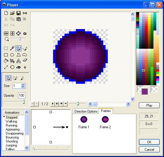
So for now I've fallen back onto my old friend, MMF2's inbuilt sprite editor. Which is more then functional for my needs. It's completely economic for me, it's something I already have and know. Just sounds a bit odd. 

"Oh I'm making this game in AGS, it's really art asset heavy so I spend a bunch of time doing pixel art... No.. actually I use this sprite editor from a completely different game making program... Why aren't I making the game in that other program then? ... Because.. Because I like this editor."

So until I am as familiar with another program I'm just going to use this. 

Looks simple right? That's because it is. Unfortunately this isn't one of those free programs. Really sorry everyone. Honestly though, just use paint and remember to save as a png. That served me just fine for quite a while.. but, for me, with this I can instantly make a new frame with this one instead of saving, then drawing over, then re-saving. So for now I'm just going to work with this one. If anyone's interested in me looking into any of the other free paint programs or do help/tutorial bits on them, I'd love to. But for now I'm going to keep on task, plus no one reads this anyhow. :P

First I had this awesome idea for a gif. But then I realized... I don't even have an avatar for my profile in the forums.. That's sad. Heck, I don't have a personalized avatar anywhere. I just like my pictures of Koalas. God knows there's nothing wrong with that. Bless those little toxic rabid bunny bears.

So that's my first project. 120x120, animated, and see if I can get the level of artz that I see in my head for this project.

(I'll upload the original photo later)
So I messed around with my phone taking selfies, and feeling crap about myself the whole way...mostly because I was aware of myself taking selfies and that I'd have to divulge that fact to the world later here. And ended up with something I didn't quite hate. Then I decided to crop it in the image to leave out my nose. I like the placement of the head, the glasses going off the bottom. And now I just need to do a whole lot more work. This is kind of the first step. Thinking on it now, what I should have do is create a new frame every time I draw a new line/edited it. Then when I'm done I'll have a gif that captures the entire process, the journey is always so much more impressive then the actual finished product. As you can see on the left corner of the subject's brow I attempted crosshatching for the first time with pixels. Not actually bad from a distance, i'll have to experiment more. Bringing that up you can see that the light is actually oriented on both sides from behind the suspect, stronger on one side then the other. Also the eyes look slightly crooked, this is actually just my face being off. One ear is higher than the other so not only do my glasses sit on my face a little crooked, but I tend to hold my head on a slight angle.

My aim at the end of this is to have a realistic(ish) shading, get better at this crosshatch thing(because my project goes for a comic book aesthetics)...

My glasses actually aren't that massive, there about a size or two down in diameter. So.. like maybe three of four pixels smaller in diameter. And they're a little more oval. I have old person glasses, I find them classy. 

On that note I think I captured the distortion from the lens pretty well, it looks like that was what I was trying to do an not just me being bad at art. 

Anywho by the end of this I'd like to have a fully rendered face with some animation. Possibly a bit of background, or not. No, that'd be terrible. I'd like to mention very quickly that this stream of consciousness writing is for the soul purpose of the reader's benefit. My purpose is to show the process. And the process of every work --world changing or seemingly insignificant-- is a great deal of second guessing and consideration, it's also a great deal of, "yeah this is what I got.. it's not great right now, but I'm going to do more." and then doing all of that more until it's finished. It's be prepared to look unsure of youself, and less qualified to be speaking then others, and ignorant, and incompetent. It's being prepared to be sure in yourself enough to let go and show all of that fear and self doubt. To just go all out with what you love regardless of how it looks. Does a blind man dance for others or for himself?
... 
Alright, that's a little out there, what I mean is when you do something that's about creating, and having fun, and self therapy, other people watching you do it shouldn't even be on your mind. I'm not saying ignore people who enjoy your work or don't consider constructive criticism seriously, but don't loose the heart of the thing you love in the idea of others, they don't matter so much for you to have your favorite thing ruined.

.. what the heck was I talking about.

Oh right. I'm going to stick with the gray or similar simple background as a means to draw focus to the character, the animation in the fact of moving will not need help drawing focus. In design simplicity is kings. And the thirds rule is queen. And form over color and text. But be careful around graphic designers with that. We're a very opinionated people. Honestly though, it's form. Design an image like you're colorblind and can't read, focus on form, then add color.. and honestly I don't even know why they have text separately, technically the font is just picking shapes that will go on a page, that falls under the form.. Whatever, I only studied graphic design for a year at school, that's half the program at most, I'm not a real graphic designer. 

Now in my opinion as a stationary image and one that will be on a loop and animated avatar should have a circular animation rather then one that breaks. What I mean by that is say that I used the large empty space to the left of the subject's face and had a hand slowly raising a steaming mug of coffee, have it come to rest briefly, then go down below the screen. My issue with this that visually it's going from a "off" to a "on" position. Mug up->Mug down (repeat)

It's easily distinguishable and feels slightly fractured, it's not a complete smooth continuation of motion, the start and stop nature of it makes it distracting in the corner of the eye.. and to me irritating. It's like watching two bored slow children on a sea-saw, they don't care for it, it's boring, they're just doing it because they can. 

Now say the animation was the mug slowly raising from the bottom, coming to the middle resting for a brief moment, then the animation rest, the mug slowly coming from the bottom again. We see this commonly with reaction gifs. This have definitive ends to the animation and are more synonymous with visual jokes or a punch line. It's a visual sentence.. that gets repeated forever. In the forums this is typically fine behavior, and interesting subject. Banter creates humorous context between two people in a manner that's typically referred to later as "you had to be there" but than an image or emote that's typically mutually understood is used to embody the physical body language, and room dynamic, that might not otherwise exist on a text-form of communication. Text alone is nearly without context in comparison to the other forms of communication we're use to. So the gif can be a punchline for a joke in which you're always there for... unless you don't understand the reference that is. I think if you're introduced to the idea of gifs as part of everyday netchat you have enough context to understand it's (otherwise seemingly arbitrary) placement as a joke. Like you don't get the reference but typically you can see the humor regardless.

Like So


The difference here is that gifs are normally very quick and continue back into themselves instantly. As it is a continual flow of motion it is in a manner creating a visual circle. Bit of an awkward one --like a oval-- but circular non the less. The importance of having a circular animation is creating something that can remain stationary, continue moving, and still look natural. I'll go more into this later but the point is to have something that is dynamic and interesting while fading into the background. This is hugely important with designing idle stances for characters and for animated backgrounds (see I had a point all this time). You animate your background to make an ordinary room more dynamic or control the flow of transitions in room changes or event triggers.  But  you don't want to pull the player out of the experience or draw their attention away from the avatar in game. "Would you look at that, the lighting flashes from that same spot ever two minutes." The background should be just that, a background(unless it's a plot event) animated backgrounds when done well are fantastic, they aid the illusion of depth to your world and aid your player's sense of autonomy within that world. The player walks through a bush and that bush shakes as they pass, giving the player the sense their avatar is has mass and taking the shortcut through the bush instead of walking around was an actual choice and that the choice was meaningful. The best way a designer could emphasize the choice of going through the bush as different than walking around could be in lowering the avatar's speed as they pass through. Or if they pass through while running instead of walking, lower the speed while taking a small amount of damage. This all adds to the player's sense of autonomy, running or walking and where they run or walk is a choice that has repercussions. This sense of allowing the player autonomy while balancing games is what leads to a structure that allows the player to devise strategy and tactics. If a zombie was running at you, you might take the long way through the bushes slowly instead of running around so-that the zombie would follow you, taking damage and coming out of the bushes slowly giving you time on the other end to hack away at the undead mob. In starcraft steam vents shield units from radar, certain obstacles need to be attacked to be broken down, and ledges cannot be jumped. All of these make those elements of the world more real, and together form a tangible environment for the player.


I'm not animating my avatar because it's in a game though, I'm just doing it because it makes it look better, I don't have prior experience making gifs, and .. yeah. Night everyone. ^^

Good luck with your projects. 


So I'm making these things again.

So after not really being able to wrap my mind around code. I opted to step it back and start simple. Something I typically try but end up trying to sneak in more features then a program is flexible enough for. And by that I typically mean doing so meant a more code heavy revise than I could handle.. But I think I've found the right thing. And I think this might be the hardest thing for starting up designers (or those of us that have never finished a project on our own), you need to find tools that are simple enough for you to wrap your mind around using them to create your idea, and the tool has to look simple enough and be the least amount of threatening on approach that you don't feel intimidated and overwhelmed when learning.


And I was draw to ags initially the way I am typically drawn to something.. it was free. Spending the time to download and drudge through the tutorials is some of the best time I've spent. And I say that as a poor, currently under-slept, not quite starving college student. It's break right now for Christ sakes and I can't get myself to sleep in. I'm super excited to have one of my old designs not only off the back-burner (as I now have tools to slowly coax pages of scribbles into sweet digital life), but not just off the back-burner, but to see the tools at my disposal and realize how very doable this vision is. Often with a design orientation, you get an idea for something --and any good designer will tell you, it's not the thing that matters it's the manner in which it works, that makes a truly good design-- and when you don't have any training or understand the vocabulary of how your pen works(coding; in a manner of speaking) then you have the assumption your grand idea isn't possible and is too complex mechanically. And that's what I had thought for the longest time with many of my designs, so what did I do. I focused on the gameplay, the input output relations with the player and the essentials of what really made something. Because if I could figure that, and break a game down to it's smallest components, and then possibly get myself to the point of building those components, then I could design a project solely around that singular component, and then with time build on new features learn and work up to an engine that I could use to build the stories I wanted to.

Once to build a metroid-ish/brawl platformer I started the designs for five separate titles that slowly scaled back the functions of the game until the one I started working on was literally two frogs that could either step forward or backward and were fencing with their tongues. Like a dive kick game, but it's step forward or step backward kick. Attacking while stepping forward made a simple straightforward thrust. A backward step with a attack would make a sideways slash that could parry a hit. That was it. You would go forward in an attack or move back to defend. 

And really, I'll probably end up using that same strategy to make my final products, lord knows it'd help fill out the empty file designated for finished products.
Any finished product is a trophy in itself

But my point is, it's nice to know that the set of stairs that lead to your dream projects aren't always as massive as you think. Dream accomplishments aren't nearly as impossible as we think, the tasks are actually very human and legitimately possible.

And, my goal on this blog now.. along with using it to help keep me honest and frequent with my internship writing. Is to show off how possible these dream projects are. I've always been a massive fan of Wolfire Games' marketing strategy of showing start to finish because I know how much that meant to me when I was first thinking of game design. That sudden realization that follows being introduced to your deepest dream activity as a realistic profession, "Crap.. this could be what I do. Even if I need to do a second job, I could be doing this. I could be making those kinda things." That realization that game design and creation wasn't... it wasn't something so out of reach, not a "I could never do that.." situation. And when I first saw those games being made, when I followed the squares on screen betas turn to polished alpha releases, all of that just got me so excited. I spent.. well I haven't stopped thinking about games. Not just as a retreat, or pastime like they were before, but as my worlds. Instead of retreating into a book or movie or game like it was a favored place to be comfortable and be myself in, I started retreating into these as if they were close friends that whispered hints and tricks about how to excite the audience, make them laugh, or make them care. My notebooks at school actually started being used.

BACK ON TRACK

So, soon as I pull together the braincells to figure out fraps.. (probably lost half the audience, I swear I'm not completely incompetent), I'll record myself working on this project. Possibly do a tutorial session about everything that goes wrong and how to trouble-spot where you're going wrong.. because I think I've run into almost all of the most basic ones and in trying to find what's wrong realized there isn't a single person on the internet who was simple enough to make the same ignorant mistakes I've made. Thus far I've figured all the problems I've run into by myself (I'm very proud). There will undoubtedly be more in the future. But for now I'm going to upload and dictate my design process, both selections from my notebook on how I'm mapping and keeping track of the perspectives. And mentions of what I learn, as I learn the AGS editor and coding tips and hints.

-My first error, which was one of the most frustrating, was the room I had created was unable to load the background image I had drawn for it. Which was frustrating because I'd go back and forth between the general settings and the image I had made because they were the same size, pixel for pixel; and the computer told me they weren't. The issue had been, of course, the room actually wasn't the same size as the general setting, this was because after I had made the first room I changed the general setting size. This was because I made the room, checked the size, looked at my image editor and realized I wanted it bigger. The rooms are built off the general settings but once built isn't linked to those general settings anymore. The resolution does not bend back and forth to my will in these separate rooms. So basically all I did was delete the room, remake it, and the image worked. That took me two days to figure out. I want you to see me in all my pathetic glory so when I have something to show and you're first reaction is "meh, alright.. that's kinda neat." You'll see how far I've come.

-And here's my coup de gras, or at least I hope it's the most facepalm I get learning this... Facepalm.. Facepalm Games.. that's what I should call my youtube development videos! You see you have to find a way to make it fun, you even have to make losing fun, with my history of game making, this is going to be a whole lot of fun.
My coup de gras was I couldn't get the inbuilt editor to draw walkable areas. I'd select every tool in the little bar, draw rectangles, draw line tool, draw pen tool, and all those other things.. I don't know what do.. But anytime I'd try to draw on the page it'd tell me that I couldn't do that, that I had the eraser selected. And I'd get very upset because I didn't. And it was saying crap about a properties plane, and I couldn't find what they were talking about. It made me very upset, but I had seen the light at the end of the tunnel.. this was possible and this design has been brewing in my head for almost two years, the functions I thought I couldn't do and the art-style had been brewing for four years, and that functionality was literally a number of months of work away. It was possible, I was just being ignorant, and I'd make it work. Enter roughly four days of doing almost nothing but fart around on my computer trying different things on the editor and having five tabs open looking through basic tutorials later I realized I had the properties of the room set on Walkable Area 0... as in no walkable area at all. Meaning I wasn't drawing.. which would automatically set the pen to a function that wouldn't work. 
  

No matter what you start learning, you will always start off making mistakes you will laugh at in the future. So enjoy it, realizing painful ignorance is the universe's way of making learning fun.

My next hurdle.. along with everything coding. Is to find a good paint program to get the kind of pixel art I'm looking for. So far I'm using Sketchbook Express 2011, and with some farting about I might be able to get the precision stuff that I want but right now the settings are giving a difficult to control --as it's designed for tablet and pen(a set i don't really have)-- and faded soft brush effect in the lines. And.. well I'm looking for more pixel accurate hard color effect. Plus this isn't a program everyone can download. So I've downloaded and will come up with a review for PixelStudio next post along with more on the Island.

Goodnight everyone, good luck with your projects.