Under no circumstances would I want someone to be in a position where they'd need to use Pixelstudio. As far as I could find there are no tutorials on youtube.. probably because everyone would rather use photoshop or whatever else, but still. Don't use it. I don't know if I'm just using it wrong.. but there's no reason it should be that counter intuitive. But as far as I can tell unless you upload an image with color, there isn't a way to change the color scheme past black and white, or any easy way at least. If you cut an image and attempt to move it elsewhere, the dotted line that typically surrounds it will not go away, not easily. And whenever you try to draw while the dotted line is still surrounding your image your drawing will not place. It won't stay. You can't draw. The checkered "see through" background that you typically want to utilize for the edges of your sprites once uncovered, cannot (seemingly) be covered up again. The only way I could figure to fix these problems was by deleting the image I worked on and starting over. This isn't like the program has a million buttons either, it's only a step above mspaint as far as I see, but I couldn't figure these few simply things. Things that should be big and bold obvious fixes for even me. I know this sounds like user error, to a degree I trust it to be, but in school I picked up programs like Illustrator, and Photoshop pretty easily. Heck I had Premier functional in five minutes. Maybe I'm a special kind of dull, but really if programs as intricate as Illustrator/Photoshop and whatever else don't give me this much trouble, I'm just going to write up Pixelstudio as broken. If it's just user error, I'm fine with that, then all that means is the user interface is broken. Or at least it's broken for what we're looking for.
What we're looking for is something that's accessible from the start, that has multiple frame possibilities, and that's popular enough that anyone wanting to know more about the program for whatever reason can find what they're looking for in a five minute Google search. And as much as I'd have preferred if this was it, Pixelstudio is defiantly not that. For me at least. And what happens then is you fall back on what you know, regardless of how counter intuitive it might be.

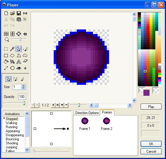
So that's my first project. 120x120, animated, and see if I can get the level of artz that I see in my head for this project.

So I messed around with my phone taking selfies, and feeling crap about myself the whole way...mostly because I was aware of myself taking selfies and that I'd have to divulge that fact to the world later here. And ended up with something I didn't quite hate. Then I decided to crop it in the image to leave out my nose. I like the placement of the head, the glasses going off the bottom. And now I just need to do a whole lot more work. This is kind of the first step. Thinking on it now, what I should have do is create a new frame every time I draw a new line/edited it. Then when I'm done I'll have a gif that captures the entire process, the journey is always so much more impressive then the actual finished product. As you can see on the left corner of the subject's brow I attempted crosshatching for the first time with pixels. Not actually bad from a distance, i'll have to experiment more. Bringing that up you can see that the light is actually oriented on both sides from behind the suspect, stronger on one side then the other. Also the eyes look slightly crooked, this is actually just my face being off. One ear is higher than the other so not only do my glasses sit on my face a little crooked, but I tend to hold my head on a slight angle.
What we're looking for is something that's accessible from the start, that has multiple frame possibilities, and that's popular enough that anyone wanting to know more about the program for whatever reason can find what they're looking for in a five minute Google search. And as much as I'd have preferred if this was it, Pixelstudio is defiantly not that. For me at least. And what happens then is you fall back on what you know, regardless of how counter intuitive it might be.
So for now I've fallen back onto my old friend, MMF2's inbuilt sprite editor. Which is more then functional for my needs. It's completely economic for me, it's something I already have and know. Just sounds a bit odd.
"Oh I'm making this game in AGS, it's really art asset heavy so I spend a bunch of time doing pixel art... No.. actually I use this sprite editor from a completely different game making program... Why aren't I making the game in that other program then? ... Because.. Because I like this editor."
So until I am as familiar with another program I'm just going to use this.
Looks simple right? That's because it is. Unfortunately this isn't one of those free programs. Really sorry everyone. Honestly though, just use paint and remember to save as a png. That served me just fine for quite a while.. but, for me, with this I can instantly make a new frame with this one instead of saving, then drawing over, then re-saving. So for now I'm just going to work with this one. If anyone's interested in me looking into any of the other free paint programs or do help/tutorial bits on them, I'd love to. But for now I'm going to keep on task, plus no one reads this anyhow. :P
First I had this awesome idea for a gif. But then I realized... I don't even have an avatar for my profile in the forums.. That's sad. Heck, I don't have a personalized avatar anywhere. I just like my pictures of Koalas. God knows there's nothing wrong with that. Bless those little toxic rabid bunny bears.
So that's my first project. 120x120, animated, and see if I can get the level of artz that I see in my head for this project.
 |
| (I'll upload the original photo later) |
My aim at the end of this is to have a realistic(ish) shading, get better at this crosshatch thing(because my project goes for a comic book aesthetics)...
My glasses actually aren't that massive, there about a size or two down in diameter. So.. like maybe three of four pixels smaller in diameter. And they're a little more oval. I have old person glasses, I find them classy.
On that note I think I captured the distortion from the lens pretty well, it looks like that was what I was trying to do an not just me being bad at art.
Anywho by the end of this I'd like to have a fully rendered face with some animation. Possibly a bit of background, or not. No, that'd be terrible. I'd like to mention very quickly that this stream of consciousness writing is for the soul purpose of the reader's benefit. My purpose is to show the process. And the process of every work --world changing or seemingly insignificant-- is a great deal of second guessing and consideration, it's also a great deal of, "yeah this is what I got.. it's not great right now, but I'm going to do more." and then doing all of that more until it's finished. It's be prepared to look unsure of youself, and less qualified to be speaking then others, and ignorant, and incompetent. It's being prepared to be sure in yourself enough to let go and show all of that fear and self doubt. To just go all out with what you love regardless of how it looks. Does a blind man dance for others or for himself?
...
Alright, that's a little out there, what I mean is when you do something that's about creating, and having fun, and self therapy, other people watching you do it shouldn't even be on your mind. I'm not saying ignore people who enjoy your work or don't consider constructive criticism seriously, but don't loose the heart of the thing you love in the idea of others, they don't matter so much for you to have your favorite thing ruined.
.. what the heck was I talking about.
Oh right. I'm going to stick with the gray or similar simple background as a means to draw focus to the character, the animation in the fact of moving will not need help drawing focus. In design simplicity is kings. And the thirds rule is queen. And form over color and text. But be careful around graphic designers with that. We're a very opinionated people. Honestly though, it's form. Design an image like you're colorblind and can't read, focus on form, then add color.. and honestly I don't even know why they have text separately, technically the font is just picking shapes that will go on a page, that falls under the form.. Whatever, I only studied graphic design for a year at school, that's half the program at most, I'm not a real graphic designer.
Now in my opinion as a stationary image and one that will be on a loop and animated avatar should have a circular animation rather then one that breaks. What I mean by that is say that I used the large empty space to the left of the subject's face and had a hand slowly raising a steaming mug of coffee, have it come to rest briefly, then go down below the screen. My issue with this that visually it's going from a "off" to a "on" position. Mug up->Mug down (repeat)
It's easily distinguishable and feels slightly fractured, it's not a complete smooth continuation of motion, the start and stop nature of it makes it distracting in the corner of the eye.. and to me irritating. It's like watching two bored slow children on a sea-saw, they don't care for it, it's boring, they're just doing it because they can.
Now say the animation was the mug slowly raising from the bottom, coming to the middle resting for a brief moment, then the animation rest, the mug slowly coming from the bottom again. We see this commonly with reaction gifs. This have definitive ends to the animation and are more synonymous with visual jokes or a punch line. It's a visual sentence.. that gets repeated forever. In the forums this is typically fine behavior, and interesting subject. Banter creates humorous context between two people in a manner that's typically referred to later as "you had to be there" but than an image or emote that's typically mutually understood is used to embody the physical body language, and room dynamic, that might not otherwise exist on a text-form of communication. Text alone is nearly without context in comparison to the other forms of communication we're use to. So the gif can be a punchline for a joke in which you're always there for... unless you don't understand the reference that is. I think if you're introduced to the idea of gifs as part of everyday netchat you have enough context to understand it's (otherwise seemingly arbitrary) placement as a joke. Like you don't get the reference but typically you can see the humor regardless.

Like So
The difference here is that gifs are normally very quick and continue back into themselves instantly. As it is a continual flow of motion it is in a manner creating a visual circle. Bit of an awkward one --like a oval-- but circular non the less. The importance of having a circular animation is creating something that can remain stationary, continue moving, and still look natural. I'll go more into this later but the point is to have something that is dynamic and interesting while fading into the background. This is hugely important with designing idle stances for characters and for animated backgrounds (see I had a point all this time). You animate your background to make an ordinary room more dynamic or control the flow of transitions in room changes or event triggers. But you don't want to pull the player out of the experience or draw their attention away from the avatar in game. "Would you look at that, the lighting flashes from that same spot ever two minutes." The background should be just that, a background(unless it's a plot event) animated backgrounds when done well are fantastic, they aid the illusion of depth to your world and aid your player's sense of autonomy within that world. The player walks through a bush and that bush shakes as they pass, giving the player the sense their avatar is has mass and taking the shortcut through the bush instead of walking around was an actual choice and that the choice was meaningful. The best way a designer could emphasize the choice of going through the bush as different than walking around could be in lowering the avatar's speed as they pass through. Or if they pass through while running instead of walking, lower the speed while taking a small amount of damage. This all adds to the player's sense of autonomy, running or walking and where they run or walk is a choice that has repercussions. This sense of allowing the player autonomy while balancing games is what leads to a structure that allows the player to devise strategy and tactics. If a zombie was running at you, you might take the long way through the bushes slowly instead of running around so-that the zombie would follow you, taking damage and coming out of the bushes slowly giving you time on the other end to hack away at the undead mob. In starcraft steam vents shield units from radar, certain obstacles need to be attacked to be broken down, and ledges cannot be jumped. All of these make those elements of the world more real, and together form a tangible environment for the player.
I'm not animating my avatar because it's in a game though, I'm just doing it because it makes it look better, I don't have prior experience making gifs, and .. yeah. Night everyone. ^^
Good luck with your projects.
No comments:
Post a Comment